The Best Scuba Diving Computers Reviewed by ScubaLab
How We Test
Click Here to download the full test data PDF from the 2014 Dive Computer Review.
------------------------------------------------
Ergo Test Protocol
The ScubaLab team of test divers evaluated each computer in seven ergonomic performance areas. Using underwater slates, divers rated performance on a scale of 1 to 5, with 1 being poor and 5 being excellent, and also provided written comments about their experience using each computer.
The ergo test categories were:
- Ease of reading primary dive screen
- Ease of understanding primary screen data
- Ease of accessing alternate screen(s)
- Ease of hearing audible warnings
- Backlight/screen illumination performance
- Ease of using safety stop feature
- Ease of accessing after-dive data
(Note — High and low diver scores for each test category were discarded, and final scores were rounded.)
------------------------------------------------
Objective Test Protocol
To gauge the performance of the computers’ algorithms, they were subjected together to a series of four dive simulations in the USC Catalina Hyperbaric Chamber.
Meant to simulate a day of diving, the dive profiles (shown in the four charts) were:
- 100 feet/60 minutes
- A one-hour surface interval
- 70 feet/45 minutes
- A two-hour surface interval
- 80 feet/45 minutes
- A one-hour surface interval
- 60 feet/40 minutes
The computers were placed in a tank of water inside the chamber, where a video camera was used to view and record each computer’s dive-screen data (listed in the spreadsheets).
Safety and conservative factors on the computers were set to their most liberal setting for the chamber dives. (In the case of Oceanic’s dual-logarithm OCi and ProPlus 3 computers, they were set to the PZ+ and DSAT logarithms respectively to gauge the differences between the algorithms.)
Note that while some computers display No Decompression Limit (NDL) data only in minutes (99 minutes) and others display hours and minutes (1:39), data is listed in the tables here in minutes only for clarity.
Special thanks to Catalina Chamber director Karl E. Huggins and chamber operators Paul Buechner, Scott Barnes and Kim Whiteside.

Zach RansomScubaLab tried out 12 new and redesigned wristwatch, wrist-mount and console models
12 New Dive Computers
For all the advances in dive gear, it’s computers where our gee-whiz factor really kicks in. Four-gas air integration in a wristwatch, color screens the size of smartphones, dual algorithms, location transponder — you name it. Today you can find a computer just as compact and complex — and, fortunately, just as simple — as you’d like. ScubaLab tried out 12 new and redesigned wristwatch, wrist-mount and console models — first with our test divers at Blue Grotto cavern in Williston, Florida, then at the University of Southern California Catalina Hyperbaric Chamber. Read on for our reviews of each model and a summary of test procedures.
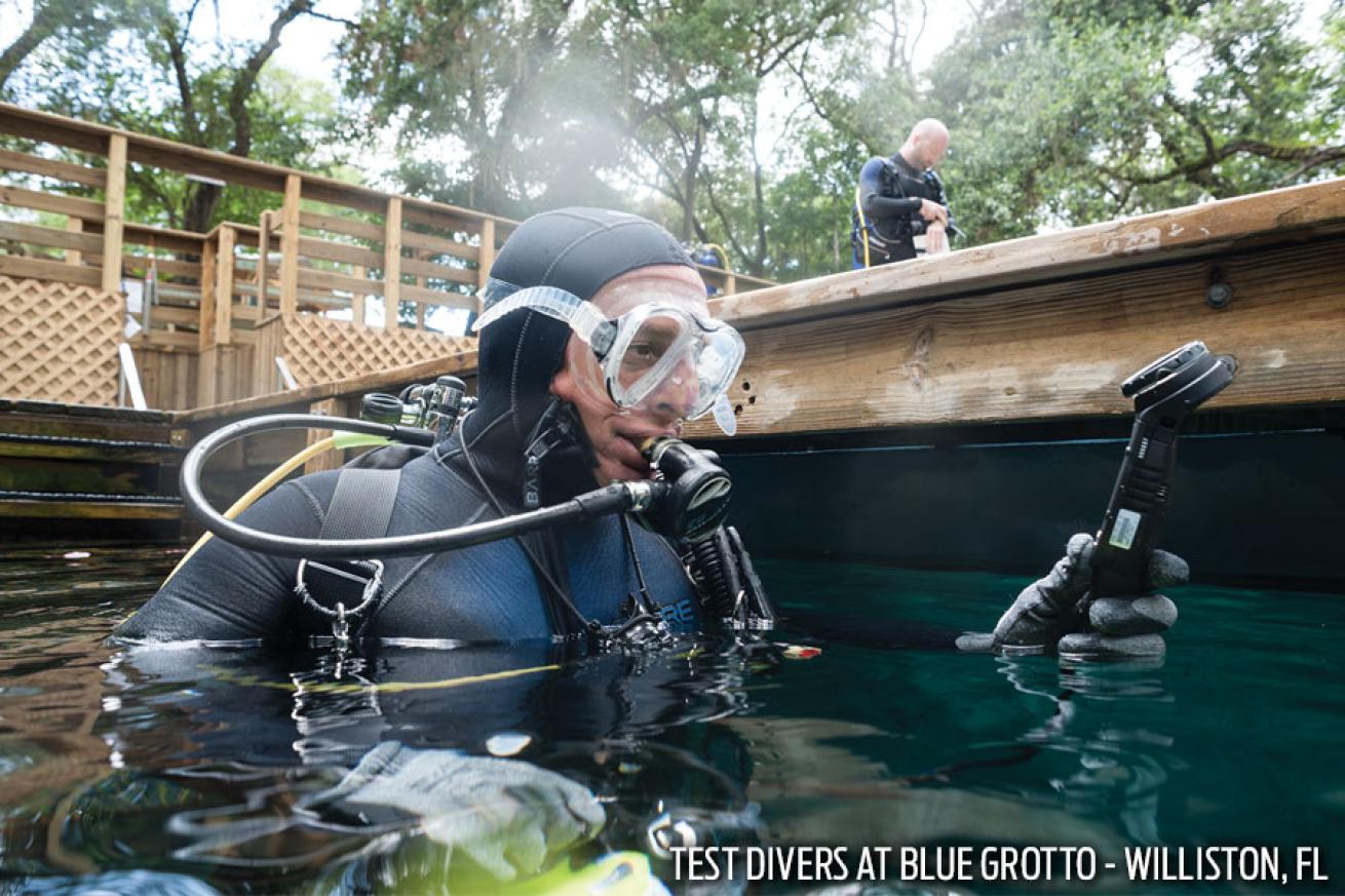
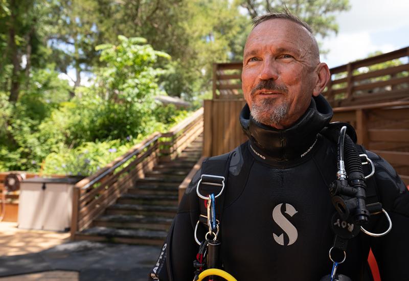
Cameron ThorpeA ScubaLab test diver prepares for his dives at Blue Grotto.
How We Test
Click Here to download the full test data PDF from the 2014 Dive Computer Review.
Ergo Test Protocol
The ScubaLab team of test divers evaluated each computer in seven ergonomic performance areas. Using underwater slates, divers rated performance on a scale of 1 to 5, with 1 being poor and 5 being excellent, and also provided written comments about their experience using each computer.
The ergo test categories were:
• Ease of reading primary dive screen
• Ease of understanding primary screen data
• Ease of accessing alternate screen(s)
• Ease of hearing audible warnings
• Backlight/screen illumination performance
• Ease of using safety stop feature
• Ease of accessing after-dive data
(Note — High and low diver scores for each test category were discarded, and final scores were rounded.)
Objective Test Protocol
To gauge the performance of the computers’ algorithms, they were subjected together to a series of four dive simulations in the USC Catalina Hyperbaric Chamber.
Meant to simulate a day of diving, the dive profiles (shown in the four charts) were:
• 100 feet/60 minutes
• A one-hour surface interval
• 70 feet/45 minutes
• A two-hour surface interval
• 80 feet/45 minutes
• A one-hour surface interval
• 60 feet/40 minutes
The computers were placed in a tank of water inside the chamber, where a video camera was used to view and record each computer’s dive-screen data (listed in the spreadsheets).
Safety and conservative factors on the computers were set to their most liberal setting for the chamber dives. (In the case of Oceanic’s dual-logarithm OCi and ProPlus 3 computers, they were set to the PZ+ and DSAT logarithms respectively to gauge the differences between the algorithms.)
Note that while some computers display No Decompression Limit (NDL) data only in minutes (99 minutes) and others display hours and minutes (1:39), data is listed in the tables here in minutes only for clarity.
Special thanks to Catalina Chamber director Karl E. Huggins and chamber operators Paul Buechner, Scott Barnes and Kim Whiteside.
Suunto D4I NOVO
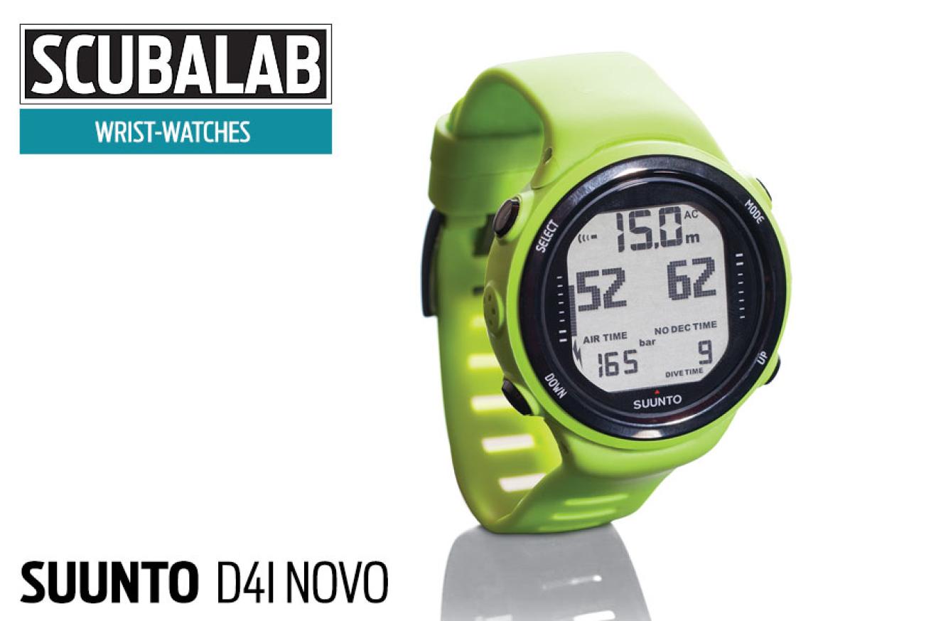
Jon WhittleSuunto D4I NOVO
The latest version of Suunto’s D4i wristwatch comes in a range of flashy colors (and basic black), and the bezel screen is a little different. Otherwise the functions are familiar, with the same four-button navigation as the original D4i. Its menu navigation is reasonably intuitive, and functions like nitrox and personal conservatism settings are easy to access and adjust. test divers also liked the buttons themselves, which are raised and have a crisp, sure feel to them, even if you’re wearing gloves. In dive mode, the display shows cur- rent depth, max depth, elapsed dive time and, in the largest characters, NDL time (NDLs more than 99 minutes aren’t displayed). In optional air-integrated mode, the screen also displays Air time remaining to the left of NDL data, and tank pressure is displayed both numerically and with a graphic along the left side. A vertical bar graph on the right (which some test divers found a little hard to see) shows ascent rate. As is common with wristwatches, once you get beyond main data like NDL, depth and air time, the script next to the data is pretty tiny, but the D4i Novo's lay- out emphasizes the most important info. the D4i Novo, using Suunto’s reduced Gradient bubble model (RGBM), was just slightly on the conservative side among this group in our chamber dives. our test divers said they especially liked the Novo’s after-dive display and its log presentation — which shows dive time and depth as you scroll through a graphic profile of your dive.
MSRP: $765 computer, $450 transmitter // Gas mixes: 1 // User controls: 4 buttons // Compass: No // Info: suunto.com
Mares Smart
Jon WhittleMares Smart
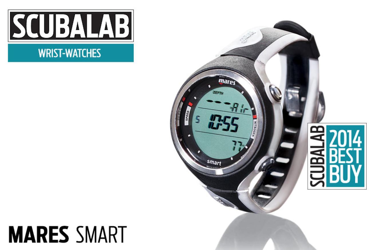
It matters how many features a dive computer has, but it matters more how well its features are executed. A case in point is Mares’ new Smart. It doesn’t have the longest list of goodies — there’s no air integration or compass — but what it does, it does very well. the dive-mode display is well thought out and easy to see and understand, with data for depth, NDL, dive time and temperature, along with a tissue-loading bar graph and ascent-rate indicator. the alternate-dive-screen data include maximum and average depth, gas mix, oxygen-toxicity level and current time. The smart’s two-button system is easy to navigate and logical in dive mode, in which the upper button modifies the top row of the display while the lower button toggles through alternate displays on the lower right. Test divers found the system very intuitive. the backlight is good, as are the visual and audible alarms. A large “slow” warns of too-rapid ascent, and there are warnings for MOD and oxygen toxicity. There’s also a tissue-loading bar graph on the right, although some divers found this a little hard to see. Divers found the smart among the easiest wrist- watches to read in bright sun, and they also liked its surface-interval countdown timer. In our chamber dives, the Smart’s RGBM algorithm was about middle-of-the-road in conservatism. Despite its relatively modest price, the smart also has a refined look, with its stainless bezel ring and buttons. The Smart was ScubaLab’s Best Buy in its category.
MSRP: $450 // Gas mixes: 2 // User controls: 2 buttons // Compass: No // Info: mares.com
Tusa IQ-1201 Talis
Jon WhittleTusa IQ-1201 Talis
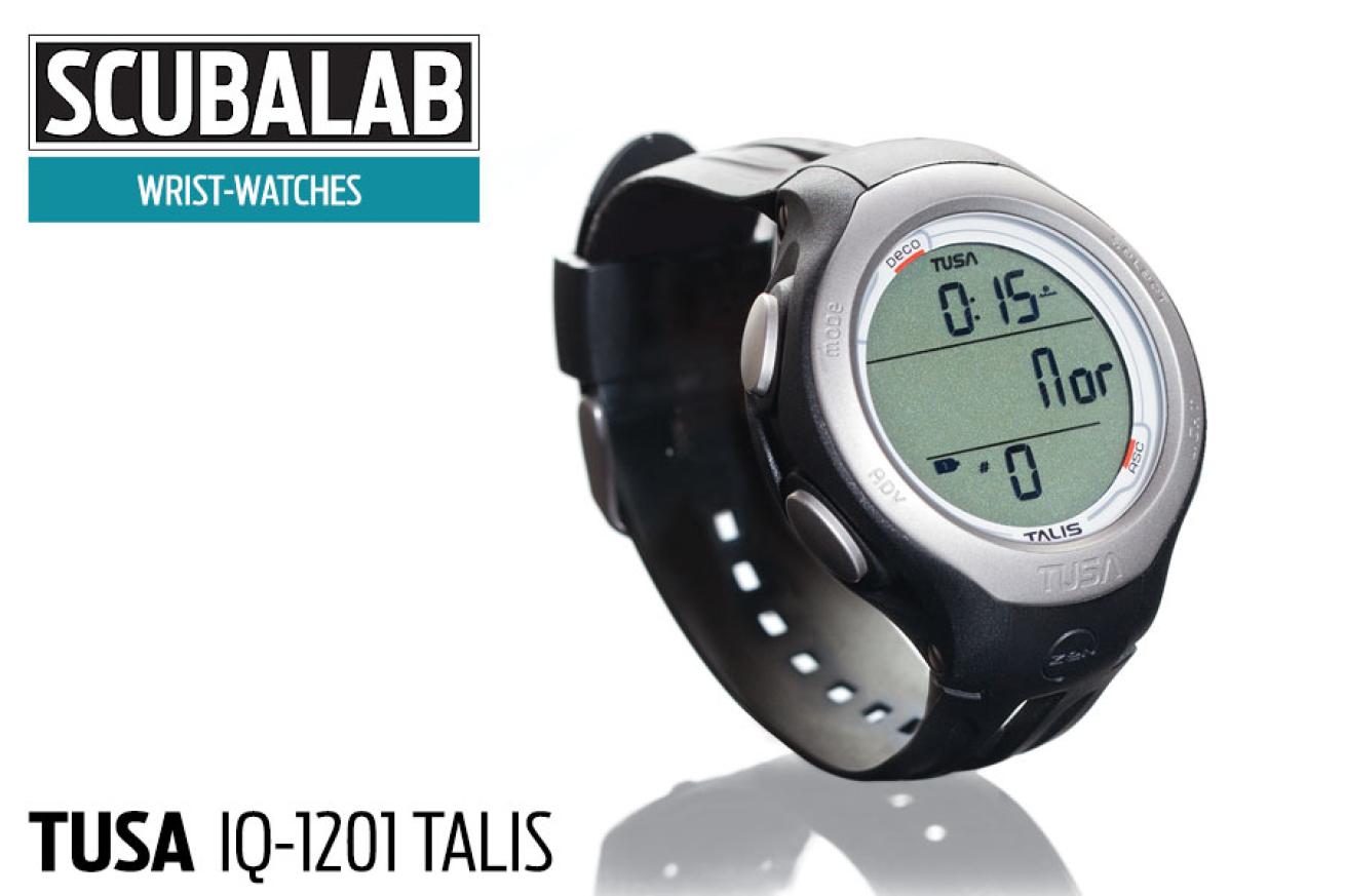
Tusa’s new two-gas wristwatch computer uses a four-button menu navigation system that is relatively straightforward, and we found the manual for the Talis to be one of the better ones in this batch of computers. On the dive screen, NDL is shown on the top line next to the tissue-loading graphic, while dive time is displayed in the middle, and current depth is shown at the bottom. The maximum depth is displayed on the alternate dive screen. The designations for the NDL (called Dive time remaining in the Tusa manual) and elapsed-dive-time displays are indicated graphically — NDL is shown using a dive profile and dive time is shown using a dot below a wave graphic. Test divers gave mixed reviews on the effectiveness of this display: some thought it was simple and straight-forward, even one of their favorites of the test batch, while others found it less than easy to grasp at first use. The menu navigation was fairly easy to maneuver through, whether changing gas settings and nitrox levels or scrolling through the dive plan. Test divers said they liked the safety-stop feature on the Talis, which has easy-to-read depth and countdown timer displays. They found the ascent-rate bar graph to be easily understood as well. The alarms and warnings on the Talis are well thought out and easy to understand, including the rapid-ascent warning, which includes an audible tone, a flashing “SLO” in large letters, and flashing ascent-rate bar graph.
MSRP: $469 // Gas mixes: 2 // User controls: 4 buttons // Compass: No // Info: tusa.com
Oceanic OCI
Jon WhittleOceanic OCI
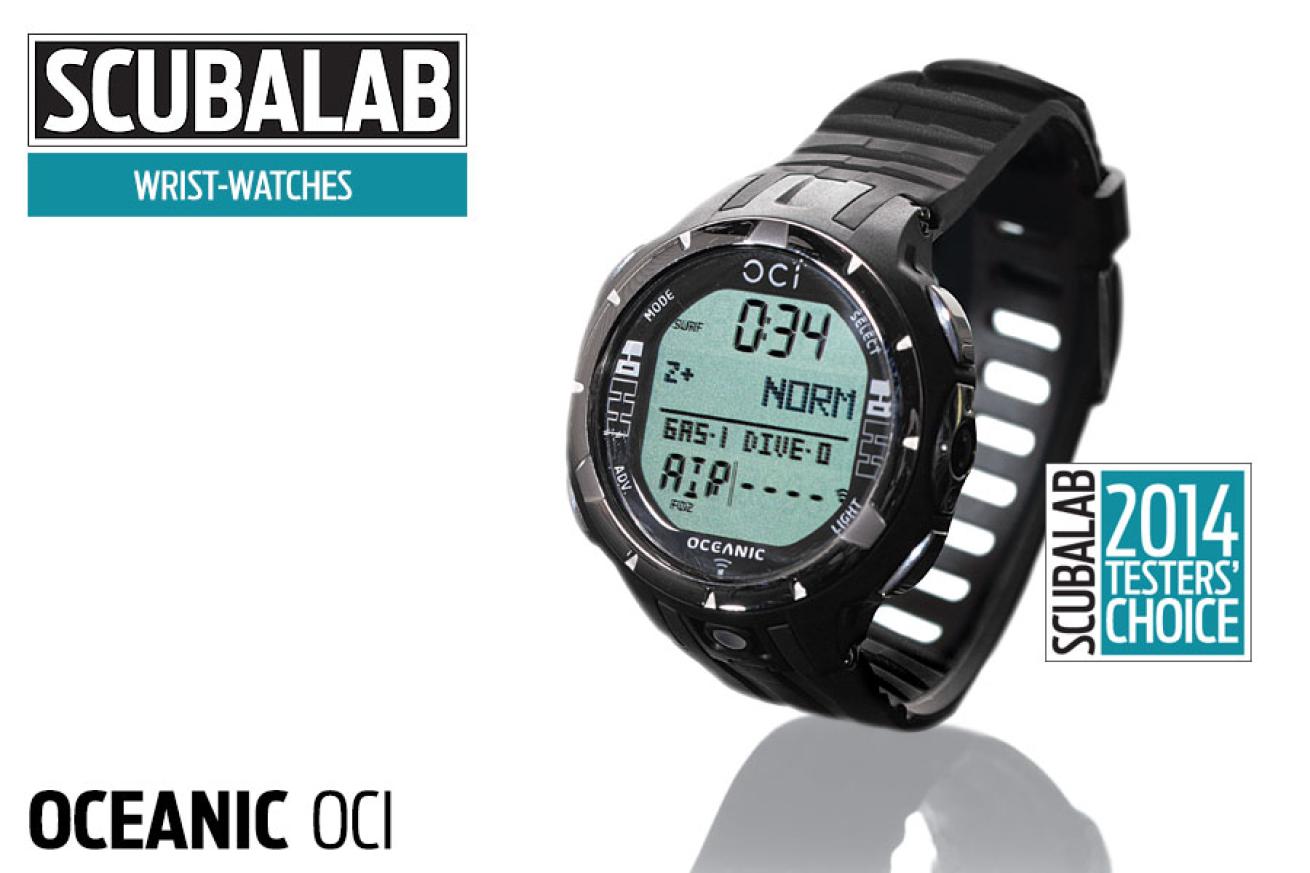
No dive computer is much fun if you have to struggle to set it and use it — especially if it’s one with as many features as the new OCI, with its four-gas air integration and dual algorithms. Fortunately, not only are the OCI's features very good in themselves, they’re also designed in a straightforward, intuitive manner that makes them a snap to access, set and understand. The dive display is well laid out and easy to see, with depth and NDL, gas selection, pressure and time remaining, tissue loading and variable-ascent-rate bar graphs, as well as useful data on the alternate screens. The four-button navigation makes sense even before you read the manual (which is also good), and the wide, stainless buttons operate with a reassuring click. The menu navigation makes it easy to set and select gases, or choose between the more-liberal DSAT and more-conservative Z+ algorithms (choice displayed in surface mode). You access the digital compass with one push and stow it with one more. Those who like digital compasses that look like analog pointers might not care for the OCI’s, but it gets the job done. The OCI has enough features that you’ll have to play around a while to explore them all (like nitrogen calculations in tec-free-dive mode), but it’s easy to wander through the menu. Test divers found a lot to like about the OCI — from its data display and presentation to its backlight — and several considered it perhaps the most stylish of the wristwatches. The Oceanic OCI is our Testers’ Choice for this category.
MSRP: $1,195.95 // Gas mixes: 4 // User controls: 4 buttons // Compass: Yes // Info: oceanicworldwide.com
Sherwood Scuba Amphos Air
Jon WhittleSherwood Scuba Amphos Air
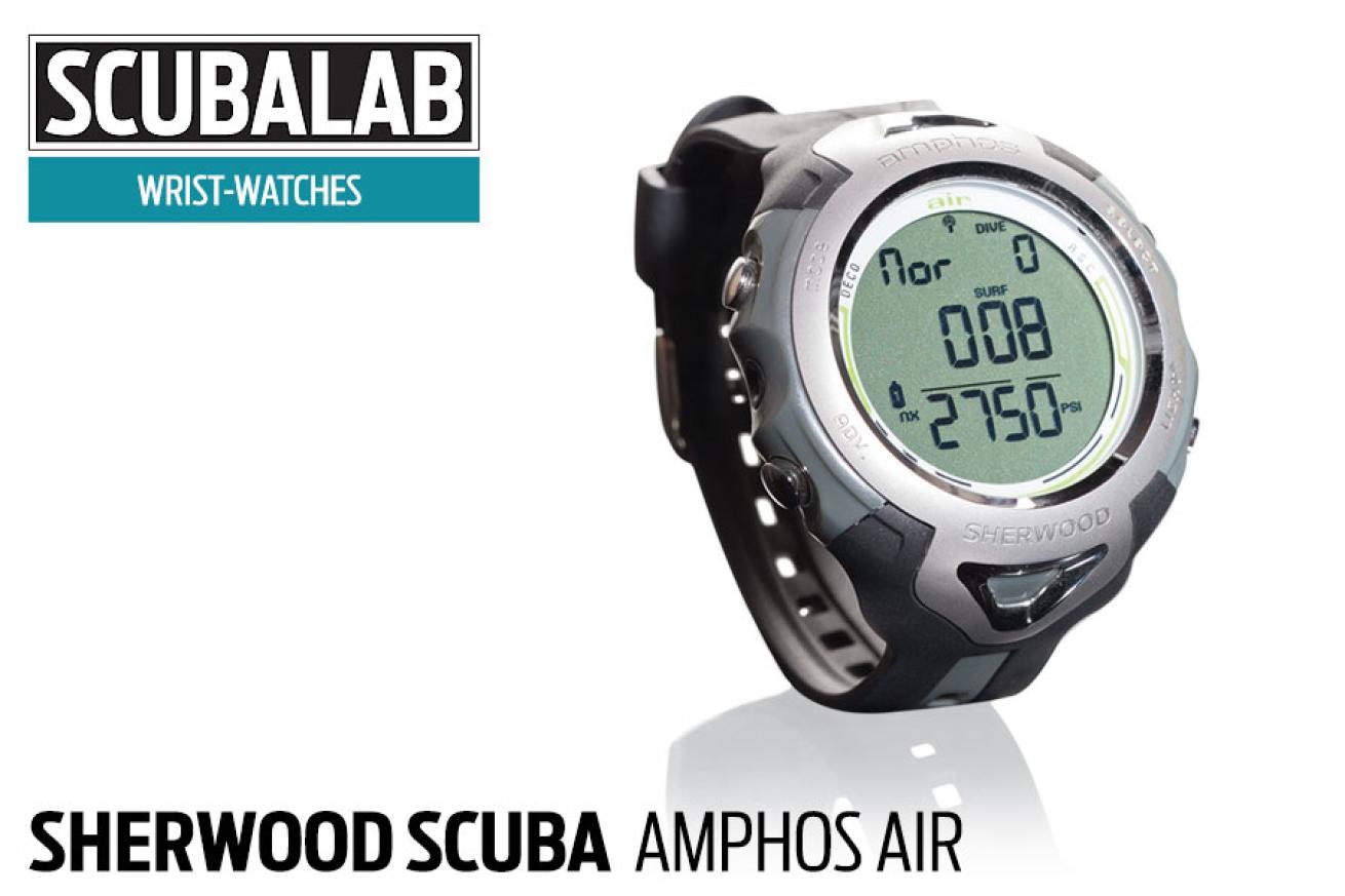
Like the original Amphos — Sherwood’s first watch computer — the Amphos Air has an algorithm and display concept based on the popular Wisdom 3 console, but it adds air integration with two-gas switching capability. Test divers rated the Amphos Air’s dive display very good, with the information well presented and easy to see and understand. Our testers said they liked the screen layout, as well as the bar graphs for ascent rate and nitrogen- and oxygen-tissue loading, and the safety-stop presentation. the Amphos Air uses a simplified display function sherwood calls Dive time remaining; this is simply the NDL, unless your gas supply becomes the limited factor, at which point the screen displays Air time remaining. An Air time remaining alarm sounds when gas supply has reached safe ascent time plus your personal setting for end-of-dive reserve pressure. There are also audible and large-text alarms for deco and rapid ascent. The four-button menu navigation is reasonably intuitive (if you remember that, once into some setting menus, you use the select button to scroll and the Advance button to select). The Amphos Air is just a little bigger than the other wristwatches in our test — not necessarily enough to be bulky, but enough that it might seem a little large as a watch unless you have beefy arms. The Amphos Air was slightly liberal in our chamber dives, but you can easily activate a conservatism factor that adjusts NDLs to the next 3,000-foot altitude.
MSRP: $1,150 with transmitter // Gas mixes: 2 // User controls: 4 buttons // Compass: No // Info: sherwoodscuba.com
Scubapro Chromis

Jon WhittleScubapro Chromis
It’s no coincidence that the Chromis has the look of a multifunction water-sport watch; its swim-mode features include a stroke counter and lap timer. Its alphanumeric characters stand out immediately, which were inspired by the shape of Japanese katana swords. They are razor sharp, and that makes them seem larger than they are: more than one test diver noted the large size of the characters, though a side- by-side comparison shows they’re about the same size as other wrist-watch computers. Another distinctive feature is the menu-mode indicator that runs along the lower right side of the screen and shows where you are in the list of options in the menu: log, plan, stopwatch, dive, set, etc. press the select button (one of four buttons used to navigate through menus) at any of those points, and the indicator bar blinks as you enter that menu to access data or settings. It’s a logical system once you get the hang of it. But as you’d expect in such a compact screen, the menu indicator is tiny, and it takes pretty sharp eyes to see where you are. The basic dive-screen displays on the Chromis are pretty clear-cut and easy to understand. But read the manual carefully to make sure you fully understand screen info about data for Scubapro’s profile Dependent Intermediate stops (PDIS): a series of optional staged ceilings designed to optimize off-gassing. The Chromis was about average in our chamber dives, and allows you to choose from five levels of conservatism.
MSRP: $499 // Gas mixes: 1 // User controls: 4 buttons // Compass: No // Info: scubapro.com
Aeris A300 CS OLED
Jon WhittleAeris A300 CS OLED
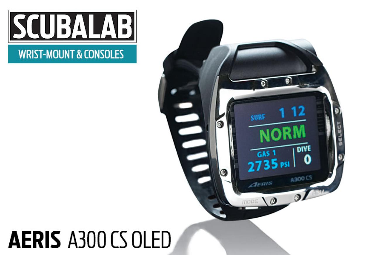
The latest Aeris wrist-mount boasts a long list of goodies, but the eye-catcher is the high-contrast, full-color OLED screen. The bright, crisp colors themselves are like candy (“gorgeous,” in the words of one test diver), and it must have been tempting to pile frills onto the screen just because they could. Fortunately Aeris avoided the temptation, and the A300 CS screen is a model of clear, concise design that uses its bold colors to best advantage (test divers rated it excellent for readability). There aren’t unnecessary borders and boxes on the screen, which allows as much space as possible for actual data. Whites, greens and blues are used to display routine info, with red reserved for attention grabbers such as deco entry, excessive PO2 or approaching tissue saturation. Data selection for the main dive screen is just right, with depth, NDL, gas pressure and air time remaining, and bar graphs for tissue loading and ascent rate that go from green to red. The alternate dive screen and screens for deep stop and safety stop are also very good. In shallow, bright water, and on the surface in the sun, you’ll need to crank up the brightness to see the screen well, but it takes only a couple of button pushes to adjust (there’s also a good auto-dim function). The computer’s three-button navigation is thoroughly intuitive, and the list of features we mentioned includes air integration for four gas mixes with individual PO2 set points, bluetooth compatibility, dual algorithms and an excellent digital compass.
MSRP: $949.95 computer ($1,249.95 with transmitter // Gas mixes: 4 // User controls: 3 buttons // Compass: Yes // Info: diveaeris.com
Mares Icon HD
Jon WhittleMares Icon HD
We swooned enough over previous versions of Mares’ Icon HD that we were determined to play hard to get this time around — in vain, as it turns out. Once again, we fell hard for the big LCD screen, the effortless four-button navigation and the digital compass of our dreams. We all get a little worried when the things we love change, but in this case, we see that it was for the best. the Icon’s new dive display is even better than before, with streamlined data presentation and improved use of the Icon’s colors. There’s still one-touch access to a dive-profle graphic, but now it intrudes less on other dive data. A new underwater menu lets you change settings — night mode, for example — and access a tissue-saturation bar graph. You can also scroll through scads of data, including gas-consumption rate, maximum depth for gas selected, CNS, PO2 and battery levels — for the Icon’s batteries as well as those in the tank transmitters. Mares also added a color-coded tank-pressure display that lets you program the pressure thresholds that trigger yellow and red. Outwardly, the Icon was left unchanged except for the new Gunmetal black edition that we tried (“such a sexy machine,” wrote one shameless test diver). For the record, the Icon’s test-diver score only rounds up to a perfect 5; in raw numbers, it was just 4.86. This suggests there’s room for improvement, but honestly, we sort of hope they won’t change a thing. the Icon HD is our Testers’ Choice in this category.
MSRP: $1,200 ($600 for transmitter) // Gas mixes: 3 // User controls: 4 buttons // Compass: Yes // Info: mares.com
Scubapro Aladin Square
Jon WhittleScubapro Aladin Square
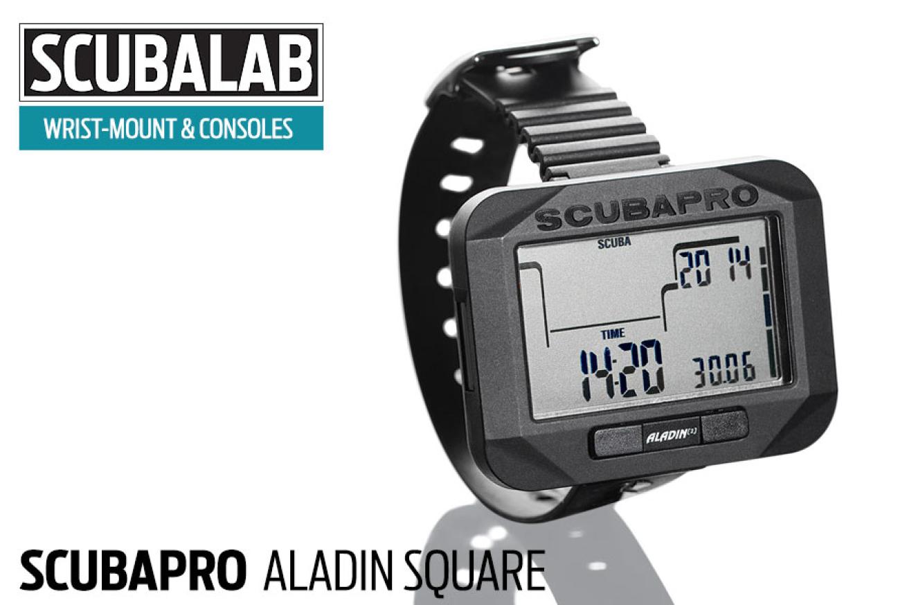
The new Square is actually a rectangle, and a big one at that — a full 2.5 inches wide, nearly the size of some smartphone screens. The wide screen, bold characters and modest display of data make the Square easy to read, even for those of us contemplating bifocal mask lenses. Test diver comments included “no information overload,” and “easy to read/ comprehend.” The two-button navigation isn’t tricky, though you might need to consult the manual at first. As you’d expect for its modest price, the Square doesn’t have a compass or air integration, but it has quite a few features and a lot of setting options. It’s programmable for two gas mixes (the second a deco mix up to 100 percent O2), has a planner for gas switching, and provides good screen prompts for switch points. There are alarms for maximum depth, dive time, two minutes to deco and entering deco, rapid-ascent rate, exceeding MOD for gas mixture, and oxygen toxicity. You can set the Square to keep your gas mixture or default to air in from one to 48 hours. The safety-stop timer is programmable, with a countdown timer from one to five minutes. The Square was about average in conservatism in our chamber dives, and can be set for five levels of conservatism. You can also select Profile Dependent Intermediate Stops — optional deep stops — that trigger a PDIS indicator and activate a two-minute timer. The PDIS displays are fairly straightforward, but you’ll want to read the manual to understand what the Square is telling you.
MSRP: $449 // Gas mixes: 2 // User controls: 2 buttons // Compass: No // Info: scubapro.com
Cressi Leonardo
Jon WhittleCressi Leonardo
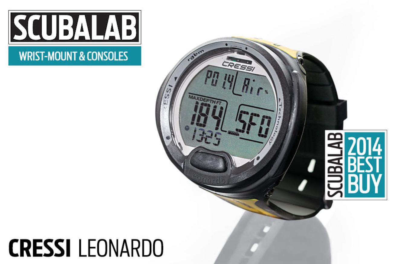
You won’t find any color LED display here, or air integration, or four-gas switching. So what do you get with the Leonardo? As it turns out, exactly what it promises: a simple design aimed at new divers “or those who just want to dive.” The nearly 2-inch-wide screen has an uncluttered display that’s easy to read, with large characters and no head-scratching abbreviations. The dive screen displays current depth, NDL, max depth, dive time, battery level and temperature, while the alternate shows gas mix, PO2 setting and conservatism factor. There are audible and screen warnings for deep and safety stops (although no safety-stop timer) and for approaching deco. An ascent-rate indicator uses an ascending stack of arrows to get the point across, and there’s an oxygen-toxicity bar graph and alarm. The one-button menu navigation is simple — press to toggle or advance; hold to enter menus or select. Since it moves in only one direction, you sometimes have to do a fair bit of pressing, but even the newest diver won’t get lost in the menu. You can program nitrox up to 50 percent, PO2 from 1.2 to 1.6, altitude, and three levels of conservatism (in our chamber dives, the Leonardo was among the most conservative in this batch). The Leonardo might be too basic for some divers, and we wish it had a safety-stop timer and a stronger backlight. But it delivers what it promises at a modest price for new divers or those who want simplicity. The Cressi Leonardo is our Best Buy in this category.
MSRP: $269.95 // Gas mixes: 1 // User controls: 1 buttons // Compass: No // Info: cressi.com
Oceanic Pro Plus 3
Jon WhittleOceanic Pro Plus 3
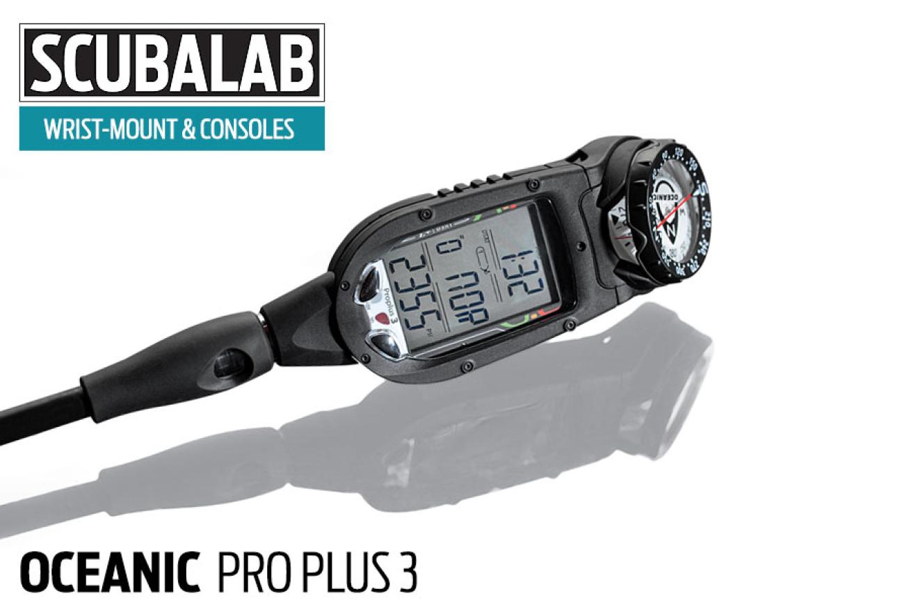
The pro plus 3 was the only console in the test group, so we compared it with wrist-mounts with full-color displays and no end of high-tech gadgetry. But the pro plus 3 held its own, scoring right in the top in its category. that’s because it has refined to a high level all the things we like about consoles: It handles three gas mixes, offers a choice of two algorithms, has an optional quick-disconnect, and uses a highly intuitive two-button navigation. but the most popular feature of the pro plus 3 among test divers was its display, which is large, arranged logically, and presents data in about as clear and concise a manner as a diver could ask. “easy to read,” wrote more than one of our test divers, who rated the pro plus 3 excellent for reading and understanding data. The dive screen shows just what you need to know, and the screen warnings are unmistakable: In letters half an inch tall, it tells you “Deco” or, if you try to switch to a gas with excessive PO2, “No Go.” running the DSAT algorithm in our chamber tests, the pro plus 3 was on the liberal side; you can select a conservative factor or switch to the pelagic Z+ algorithm, which is more conservative yet.
MSRP: $649.95 ($799.95 with quick disconnect and analog compass) // Gas mixes: 3 // User controls: 2 buttons // Compass: No // Info: oceanicworldwide.com
Liquivision Lynx

Jon WhittleLiquivision Lynx
If you’ve never dived with Liquivision’s Lynx, you’ve never tried anything quite like it. With its “tap” technology, you operate the Lynx by tapping the sides of the case. Tap to wake it up and access the menu, then scroll with taps to the top and bottom; tap right and left to make selections. Not every test diver loved it, but we noticed that the more time they spent with it, the more they liked it. It’s not just the tapping that makes the Lynx feel different: It lets you really dig into its data. scroll the menu and select “battery test,” and you don’t get a battery icon — the Lynx makes some clicking noises and reports: “estimated time remaining with default settings is 20 to 35 hours.” (thank you very much, Hal.) The Lynx screen is also notable. It’s not huge — just more than 1.5 inches across — but the vibrant colors of the display really stand out. Gear heads could spend hours wandering through the detailed menus and playing with the killer dive simulator (for chills, set the sim for a 30-minute dive to 600 feet). Along with three-gas air integration, the Lynx can monitor the gas pressure and location of up to 10 other divers. We also tried out a new ultrasonic location transmitter that lets you home in on its signal from up to 330 feet. It’s fun and a little finicky (we were in more-enclosed water than recommended in the manual, which describes the locator as “very experimental”). but it’s a promising innovation of which we would like to see more.
MSRP: $1,249 Lynx ($1,749 Lynx and tank transmitter; $649 for location transmitter) // Gas mixes: 3 (tec mode) // User controls: Tap sensors // Compass: Yes // Info: liquivision.com
Atomic Aquatics Cobalt 2 - Too Late to Test!

Jon WhittleAtomic Aquatics Cobalt 2 - Too Late to Test!
We weren’t able to put the new Cobalt 2 through our full range of dive computer tests. But we had a chance to dive it enough to see that it combines new features (six gas mixes, new software, faster microprocessor) with the things we loved about the original — a vibrant color OLED screen, crystal-clear data presentation and truly intuitive navigation. In short, we liked all the updates made to the Cobalt — which was already excellent — and we look forward to putting it through our full test.
MSRP: $1,299 with quick disconnect // Gas mixes: 6 // User controls: 4 buttons // Compass: Yes // Info: atomicaquatics.com
Sign Up for the Scuba Diving eNewsletter
Scuba Diving is the complete source for the best in diving information. Get the latest in-depth information on destinations both near and far, reviews of must-have gear, breathtaking underwater photos, news on the latest technology, updates on environmental issues and more — all delivered right to your inbox!
Looking for more ScubaLab testing? Check out more of our gear reviews:**
SCUBALAB 2014: Dive Bag Review
SCUBALAB 2014: Regulator Review
SCUBALAB 2014: BC Review
SCUBALAB 2014: Dive Lights Review
SCUBALAB 2014: Wetsuit Review
SCUBALAB 2013: Fins Review
SCUBALAB 2013: Mask Review
SCUBALAB 2013: Regulator Review
How We Test
Click Here to download the full test data PDF from the 2014 Dive Computer Review.
------------------------------------------------
Ergo Test Protocol
The ScubaLab team of test divers evaluated each computer in seven ergonomic performance areas. Using underwater slates, divers rated performance on a scale of 1 to 5, with 1 being poor and 5 being excellent, and also provided written comments about their experience using each computer.
The ergo test categories were:
- Ease of reading primary dive screen
- Ease of understanding primary screen data
- Ease of accessing alternate screen(s)
- Ease of hearing audible warnings
- Backlight/screen illumination performance
- Ease of using safety stop feature
- Ease of accessing after-dive data
(Note — High and low diver scores for each test category were discarded, and final scores were rounded.)
------------------------------------------------
Objective Test Protocol
To gauge the performance of the computers’ algorithms, they were subjected together to a series of four dive simulations in the USC Catalina Hyperbaric Chamber.
Meant to simulate a day of diving, the dive profiles (shown in the four charts) were:
- 100 feet/60 minutes
- A one-hour surface interval
- 70 feet/45 minutes
- A two-hour surface interval
- 80 feet/45 minutes
- A one-hour surface interval
- 60 feet/40 minutes
The computers were placed in a tank of water inside the chamber, where a video camera was used to view and record each computer’s dive-screen data (listed in the spreadsheets).
Safety and conservative factors on the computers were set to their most liberal setting for the chamber dives. (In the case of Oceanic’s dual-logarithm OCi and ProPlus 3 computers, they were set to the PZ+ and DSAT logarithms respectively to gauge the differences between the algorithms.)
Note that while some computers display No Decompression Limit (NDL) data only in minutes (99 minutes) and others display hours and minutes (1:39), data is listed in the tables here in minutes only for clarity.
Special thanks to Catalina Chamber director Karl E. Huggins and chamber operators Paul Buechner, Scott Barnes and Kim Whiteside.

