11 Dive Computers Tested By ScubaLab
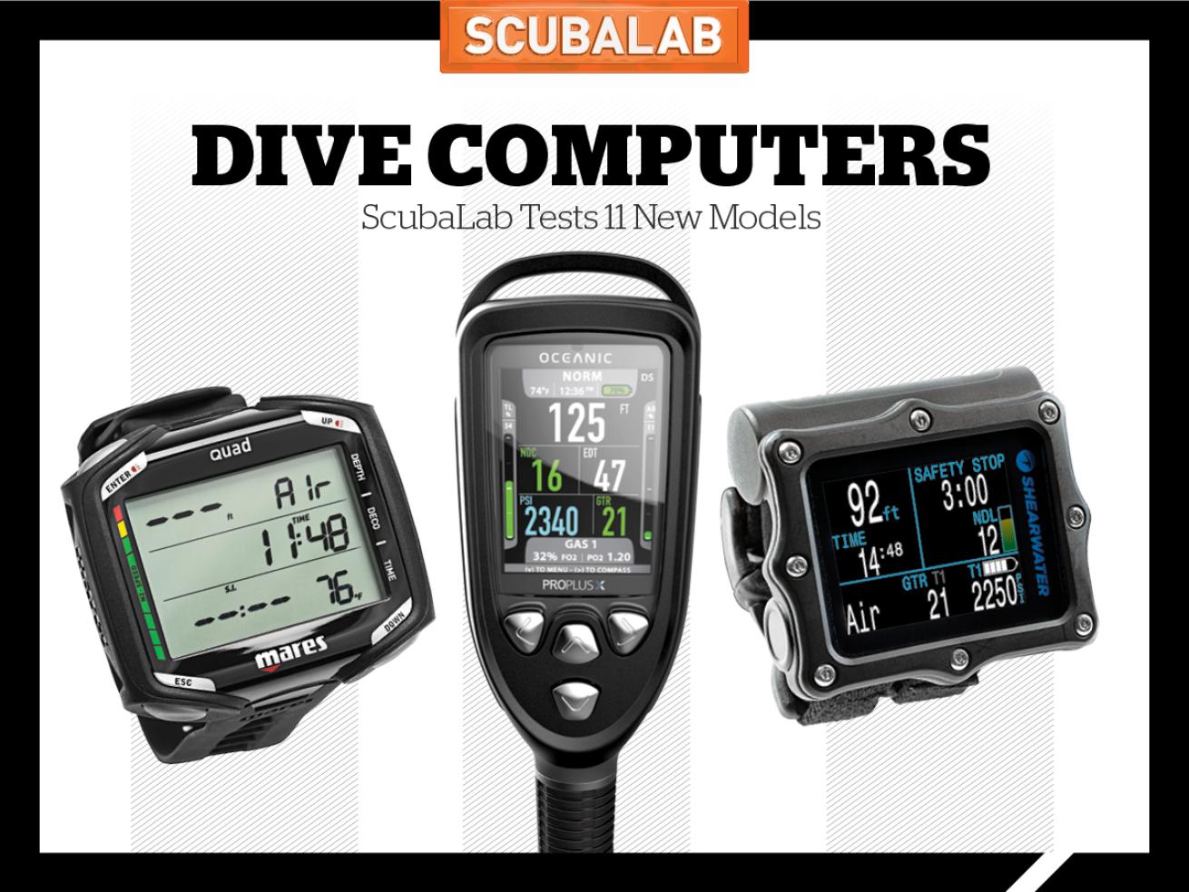
Jon WhittleScubaLab put the latest dive computers to the test. See how these console and wrist computers fared.
How We Test Dive Computers
Objective Test Protocol
To gauge the relative conservatism or liberalism of the computers’ algorithms, they were subjected together to a series of four dive simulations in the University of Southern California Catalina Hyperbaric Chamber. Meant to simulate a day of scuba diving, the profiles were: 100 feet/55 minutes; a one-hour surface interval; 70 feet/45 minutes; a two-hour surface interval; 80 feet/45 minutes; a one-hour surface interval; and 60 feet/40 minutes. Computers were set to air and configured to their most liberal settings. No-decompression data was collected from screens throughout the dives using a video camera mounted in the chamber. Special thanks to Catalina Hyperbaric Chamber director Karl E. Huggins and chamber operators Ken Hill, Armen Bagdasarian, Michael Kennedy and Brad Hall.
- Want to see the numbers for yourself? Click here to download our data from the chamber.
In-Water Ergonomics Test Protocol
ScubaLab test divers evaluated computers in seven categories designed to gauge their performance on the basis of ease and intuitiveness of operation. The dives were conducted at Blue Grotto Dive Resort in Williston, Florida, where divers used underwater slates to record their scores in each area from 5 (excellent) to 1 (poor) and also provided written comments about their experience using each computer.
How We Score
The top graph shows the score for readability underwater, with scoring of 5=excellent, 4=very good, 3=good, 2=fair and 1=poor. The bottom graph shows the score for ease of menu navigation.
Console Dive Computers
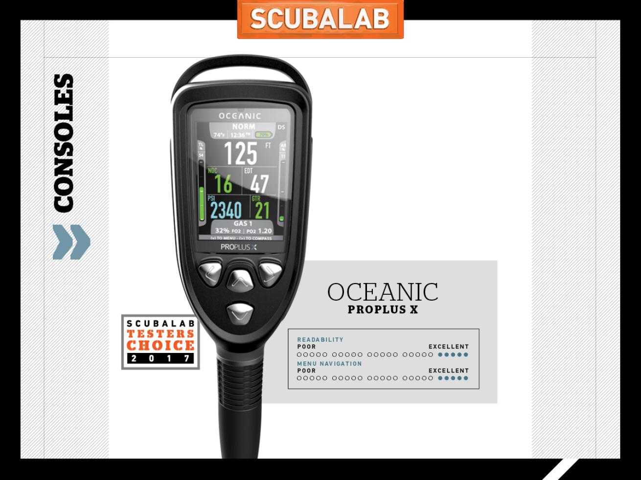
Jon WhittleThe ProPlus X is a thing of beauty and a joy to use.
Some of us are old enough to remember being content with black-and-white TV — until we saw The Wizard of Oz on the neighbor’s color job. So it is with the newest ProPlus, which in its previous black-and-white versions worked so well, it seemed frivolous to want color. But it’s not just the color screen (a “thin-film transistor” said to lower energy demand) that won us over to the ProPlus X, although testers did rate it excellent for readability underwater. The four-button menu navigation also was rated excellent by divers, who appreciated the logical menu paths made crystal clear by on-screen prompts. With a display about 2½-by-2 inches in a console 6 inches long, the PPX is a bit chunky, although the big lithium-ion battery holds a charge well. There’s also Bluetooth, four-gas capability, a quick disconnect and dual algorithms; we tested it using the more liberal DSAT. A thing of beauty and a joy to use, the ProPlus X was our Testers Choice in its category.
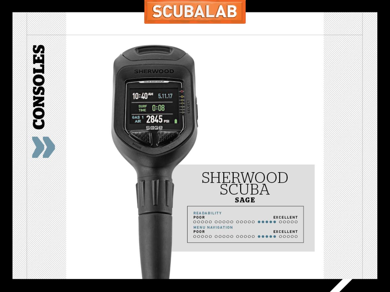
Jon WhittleThe Sage dive computer features a readable display, logical menus, advanced capabilities and a simple operation.
The Sage reminds us of Sherwood’s line of Wisdom and Vision consoles — a good thing, because they featured readable displays, logical menus, advanced capabilities and simple operation. The Sage adds a vibrant full-color OLED display. Weighing only 7 ounces and with a screen about 1.7-by-1.5 inches, the Sage is half the size and weight of the ProPlus X. Its smaller screen can’t match the huge characters of the ProPlus X, but the Sage is also more compact, fitting nicely even in smaller hands, and easier to stow on your dive rig. The Sage’s screen is still highly readable, with rich colors coded to draw your attention to critical data (though some testers found it hard to read in bright sun when shallow or surfaced). Slightly liberal in our test dives, the Sage has a user-replaceable battery, disposable or rechargeable. With intuitive menu navigation, three-gas capability and a very good digital compass, the Sage was a neck-and-neck competitor for Testers Choice.
Non-Air-Integrated Wrist Dive Computers
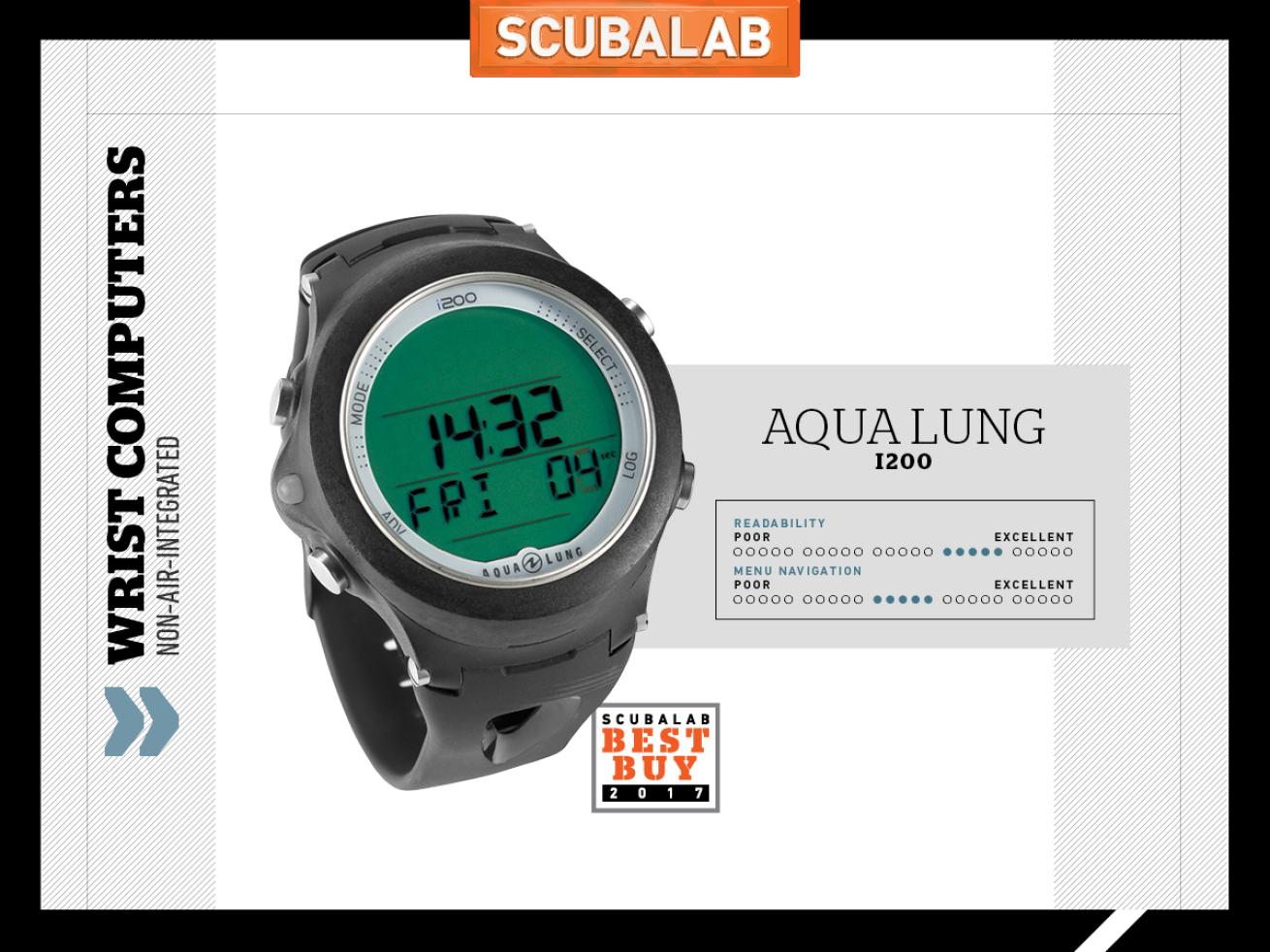
Jon WhittleThe i200 is easy to use and understand and has a nice selection of features for its modest price.
Though its screen is just 1¼ inches in diameter, the i200 is surprisingly easy to read because of its bold characters and uncluttered layout. Test divers rated it very good for ease of reading both underwater and at the surface, even in bright sun; it also has a decent, if not overly powerful, backlight. The four-button control makes relatively quick work of setting up the computer and making dive adjustments, and air/nitrox changes are easy (although adjusting the PO2 level requires backtracking to another menu branch). It also has a good safety stop, which is adjustable for three or five minutes at 20, 15 or 10 feet. Deco warnings and screen info are clear and simple, and the tissue-loading and ascent graphs, which run up along the side of the screen, are quite visible. About average in no-deco times in our test, the i200 has a user-replaceable battery and a clear, concise manual. Easy to use and understand, with a nice selection of useful features for its modest price, the Aqua Lung i200 is our Best Buy.
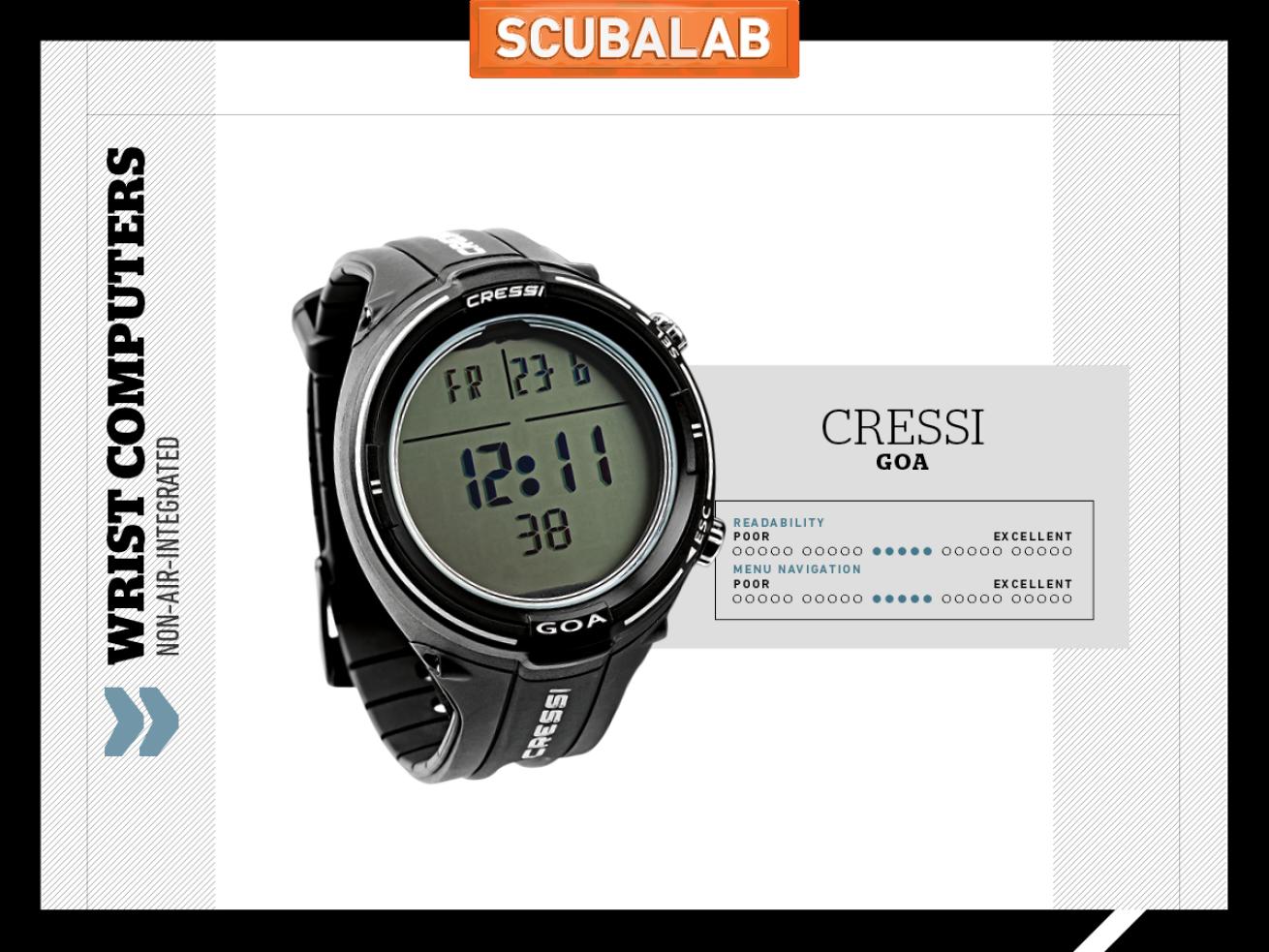
Jon WhittleThe Goa was one of the smallest dive computers in our test, but managed to display a lot of info on its screen.
The watch-size Goa was — by just a smidge — the smallest dive computer in our test, with a case less than 2 inches in diameter. It still manages to display a lot of info on its dive screen (including max depth, dive time and water temp) without being cluttered or confusing; that’s because key info such as current depth and no-deco time have large characters given prominent play in the center of the screen. It also helps that the screen (as with other Cressi computers we’ve tested) is segmented with vertical and horizontal lines that help you know where to find the data you’re looking for. Menu navigation is fairly straightforward, with the two buttons serving as scroll up/down with short pushes and select/escape with long. The buttons themselves are stainless and have a crisp, sure action that, combined with the Goa’s sleek, rounded profile, helped it earn a very good score for ergonomics (as well as admiring comments from test divers). In our chamber test dives, the Goa was slightly conservative.
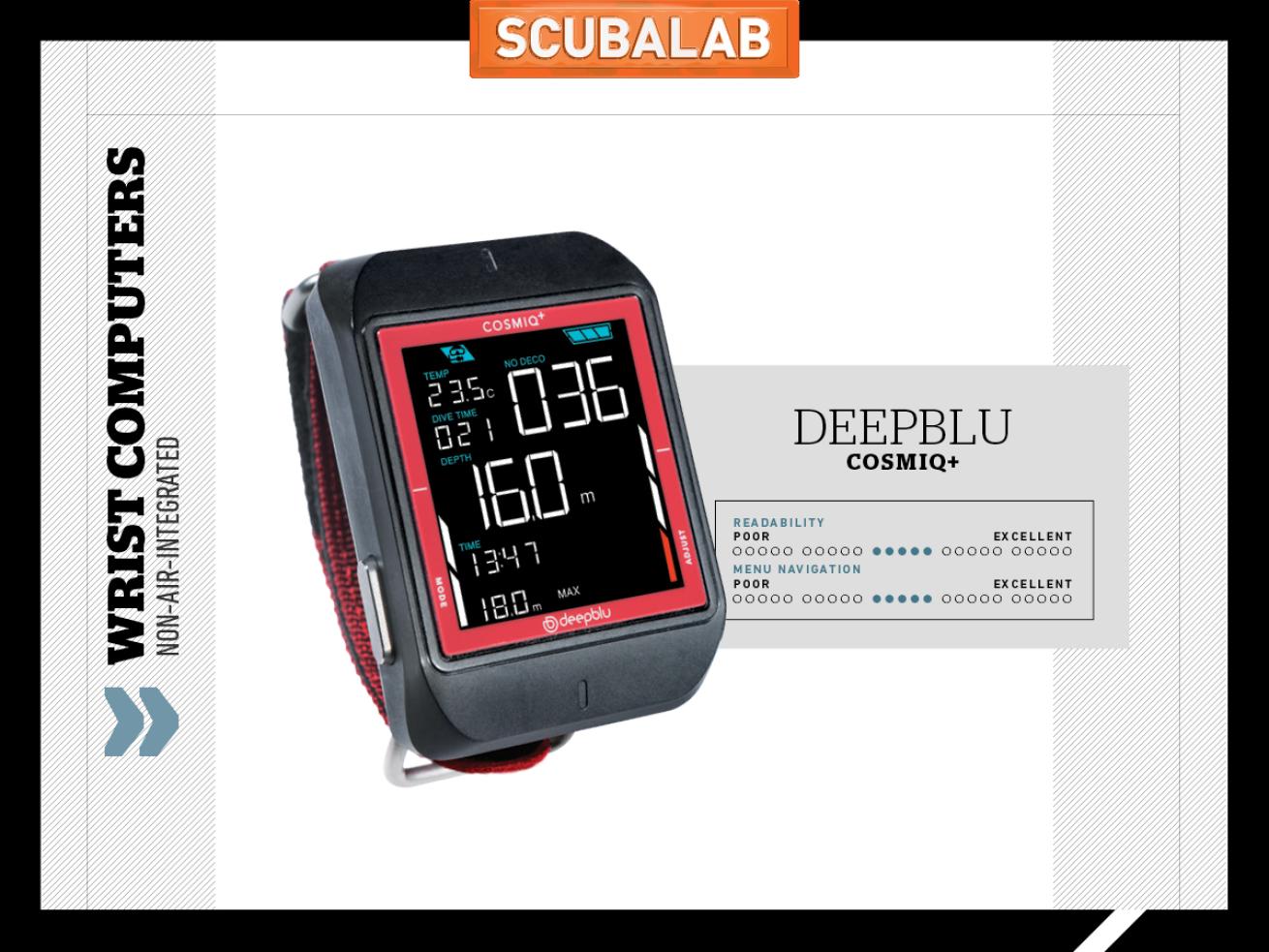
Jon WhittleThe Cosmiq+ has features that make it easier than ever to download and share your dive log data.
The Cosmiq+ is the first computer we’ve used in which the Bluetooth interface is the only way to access most settings — in fact the only scuba setting adjustable on the Cosmiq+ itself is the gas mix. But the smartphone app is easy to use, both because it’s well-organized and because the Cosmiq+ is pretty simple (and nearly identical to the earlier Cosmiq, aside from changing “gauge” mode to “bottom timer” with a couple of extra functions). Dive data is laid out clearly, and the 1½-inch LCD screen stands out well underwater, though it’s tougher to see in bright sun. Safety stop and deco screens are easy to grasp, as are the ascent and nitrogen graphs. Slightly conservative in our test dives, the Cosmiq+ has a rechargeable battery that managed a day of diving, with power to spare. Part of Deepblu’s stated mission is to create a global social platform — accessible with any computer — to share logs, photos and experiences, and the app lets you instantly post and share your dive info.

Jon WhittleThe Quad's easy-to-read display and simple operation made this dive computer a Testers Choice.
Mares says the Quad has “jumbo-size information,” and we agree; the largest characters are a half-inch tall. Still, the Quad’s screen is uncluttered because the display is 2½ inches across, made possible by the Quad’s beefy overall dimensions — 3¼-by-2¾ inches. “Kind of big,” one test diver noted, and indeed, it was the largest wrist computer here by a fair margin. But those jumbo characters and the clean data display make the Quad an easy read. The Quad’s operation was simplicity itself, especially considering it has features like three-gas switching and a programmable runaway deco alarm. The four buttons have clear functions, and the menus are a breeze to navigate. Some divers (sharp-eyed youngsters) thought the display size was overkill, and we would prefer metal buttons to the plastic ones. But the Quad took top score in its category for best menu navigation, safety stop and surface-interval screen. Slightly conservative in our dives, the Quad has a user-replaceable battery. The Quad is our Testers Choice for wrist computers.
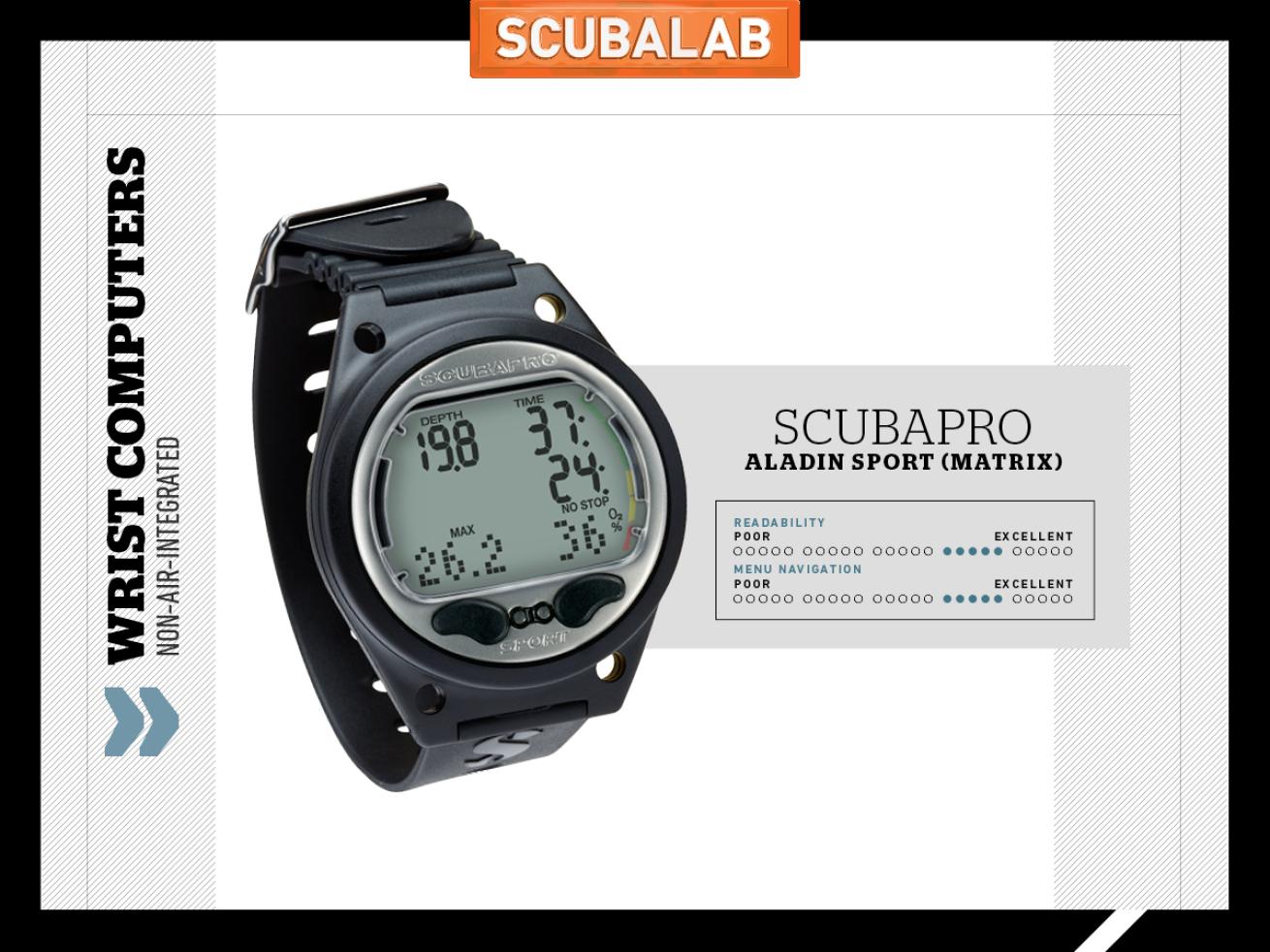
Jon WhittleThe new Aladin dive computer features a matrix display and several new functions.
The new Sport (Matrix) seems nearly identical to previous Aladins until you fire it up. That’s when you see the parenthetical matrix, a display that takes up the bottom third of the screen and has several functions. On the surface, it can scroll words with data and settings (“Saturday,” “battery,” etc.) in legible all-caps rather than the screwy hodgepodge of upper- and lowercase on some computers. During a dive, the Matrix displays data, including FO2 and water temp, and is home to the digital compass rose. The layout makes the screen more readable, earning very good scores from test divers both on the surface and underwater (though some thought the backlight a little dim). Slightly conservative in our dive profiles, this Aladin still has a two-button interface, but menu paths seem more natural, and navigation was rated good by test divers. The Sport (Matrix) has Bluetooth and a user-replaceable battery, and the best display and functions of the Aladins we’ve tried.
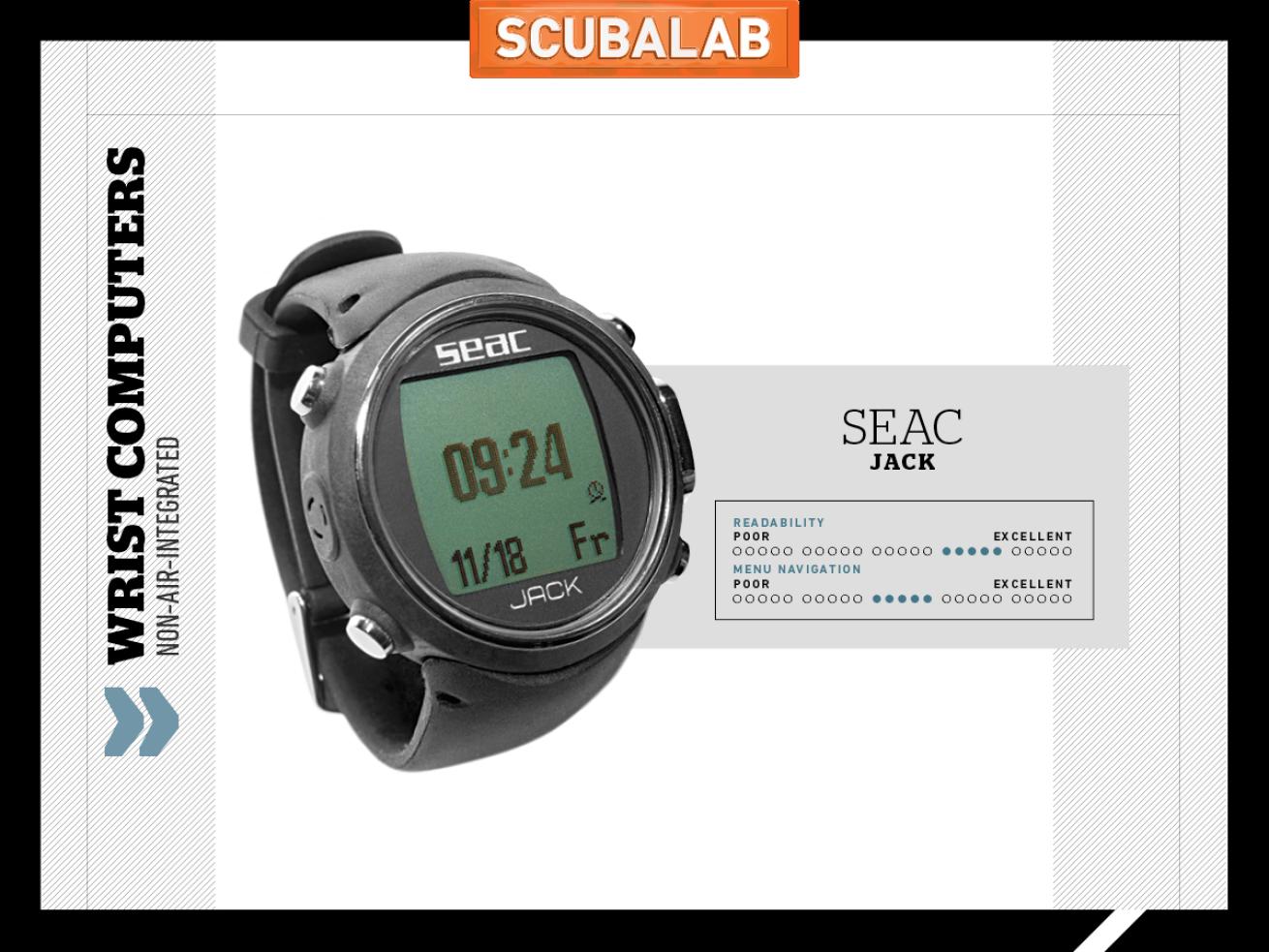
Jon WhittleThe Jack features a freedive-specific and a scuba diving algorithm as well as a compass, pedometer, moon phases, barometer and weather forecast.
The Jack packs a lot into a small package, with a freedive-specific and a scuba algorithm, compass, pedometer, moon phases, barometer and weather forecast. It also offers lots of options in many settings; for example, six levels of conservatism in the dive algorithm (just slightly liberal in our dives). We didn’t test its freedive capabilities, but Seac says it uses an algorithm designed to calculate safe surface intervals to prevent taravana and hemoptysis. Though it’s truly watch-size — and attractive enough to actually wear on land — the screen is quite readable, taking the high score in its category for readability underwater. It’s powered by a rechargeable lithium-ion that held its juice well, even with liberal use of what one tester called the “best backlight ever,” which can be set to stay on until toggled off. Squeezing in so much means long menus that can be a little confusing for the unfamiliar. But the Jack might be just the thing for the gadget-loving freediving scuba diver.
Air-Integrated Wrist Dive Computers
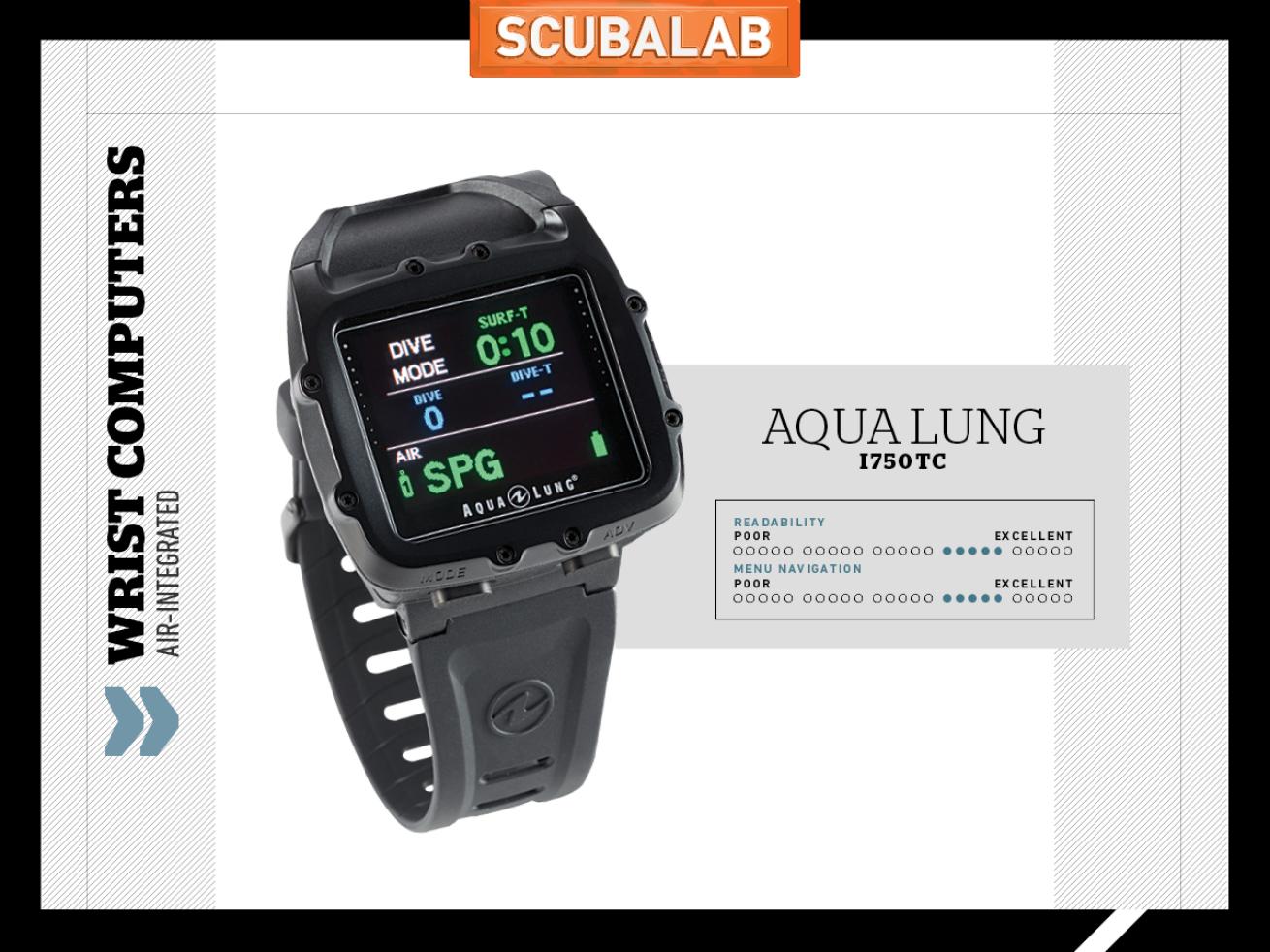
Jon WhittleThe colorful display, three-button interface and sensible menus and prompts made the i750TC a joy to use.
This category turned into a shootout between three of our favorite computers in years. Like the others, the i750TC is air-integrated, with a color screen. Its rich OLED display left us grasping for the best description of its colors; more like Skittles, or Jolly Ranchers? (Though the glaring Florida sun made the screen a little hard to read on the surface.) It wasn’t just the delicious colors that we liked, but the way they’re used to display and highlight data. Info, prompts and warnings are crystal clear, from normal status to deco obligations. Drift up on a deco stop and you’ll get a red warning: “Down to stop.” Drifting low begets: “Go up too deep.” With a list of features including three-gas capability, a very good three-axis compass and Bluetooth compatibility, the i750TC has a lot of menu options. But the three-button interface and sensible menu titles and prompts (as well as an excellent manual with color illustrations) make it easy to set and navigate — and sit back and enjoy the display.
SHEARWATER PERDIX AI
Price $1,199 | Contact shearwater.com
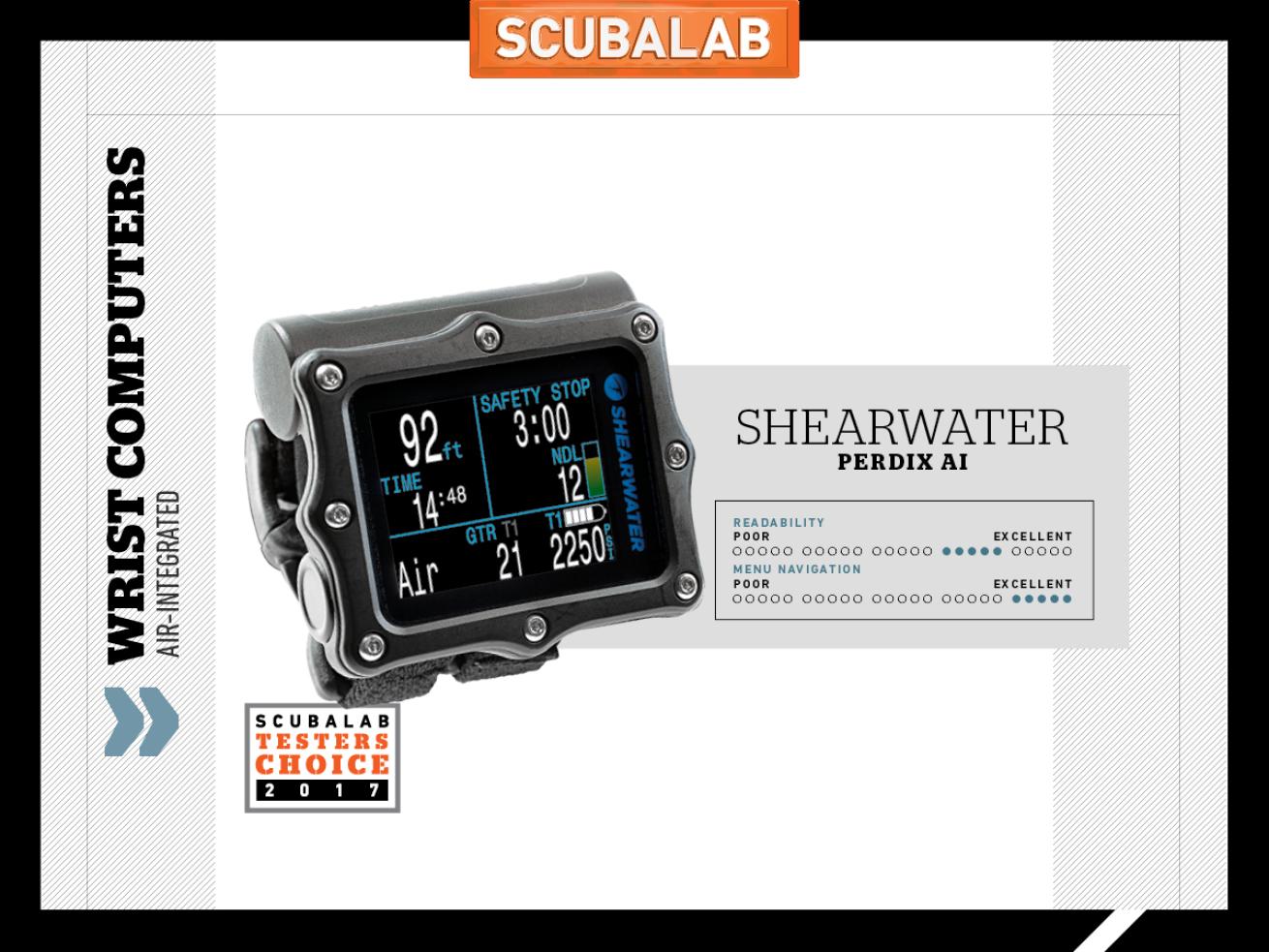
Jon WhittleAdding air integration to the Perdix's simple operation and easy-to-read display made for a winning combination.
The original Perdix was a favorite in our last test, so we were eager to try the new AI version. While we tested it in open-circuit rec mode, it has advanced capabilities (closed circuit, trimix, etc.) that are easier to set, navigate and use than some computers with only the most basic functions. The two-button interface is guided by clear menu prompts (“edit,” “change,” “save”) that helped earn an excellent score for ease of navigation. It’s as easy to read as it is to set, even with a display packed with data. The nearly 2-inch-wide screen uses color selections that can be customized (warnings and alerts also are displayed on a solid inverted background for colorblind users). You can also select which additional info to display (time, water temp, PO2, CNS level, mini compass). On the liberal end in our dives, the Perdix has three levels of conservatism. Adding new capabilities to its simple operation and easy reading, the Perdix AI is our Testers Choice for air-integrated wrist computers.
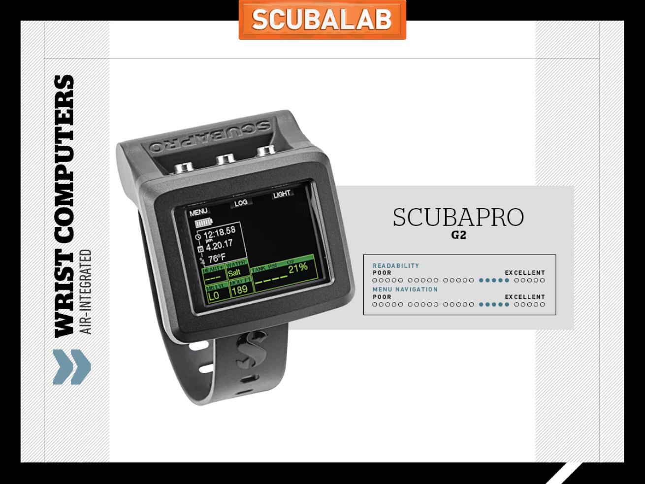
Jon WhittleThe more we used the G2, the more impressed we were.
This impressive new Galileo has so many features, it takes a while to explore them all, including a highly customizable color display and the ability to integrate biometric data into deco calculations. It offers four distinct screen layouts (as well as an inverted screen) to display data. The screen has a thin-film transistor that produces sharp, brilliant colors, with four color options. The G2’s deco calculations can take into account your workload, with data from the optional wireless cheststrap heart-rate/skin-temperature monitor. The G2’s digital compass is one of the easiest to read that we’ve ever used. Slightly conservative in our dives, the G2 has a rechargeable lithium-ion battery. The three-button interface and screen prompts help navigate menus that can be a little daunting due to the G2’s extensive features (nine levels of microbubble settings, profile-dependent intermediate stops, etc.), but the excellent color, 90-plus-page manual helps explore all this computer can do. The more we used the G2, the more impressed we were.


